ColorazaLearn · Design · Manifest

Five neutrals, and
everything that goes with them.

Pure white, soft white, beige, light grey and light taupe — the woods, metal finishes and accent colours that suit each one, and the closest match at Asian Paints, Berger, Nerolac, Birla Opus and more. Free, no sign-up.

Before you scroll

Neutrals are harder to match than colours. Two off-whites that look identical on a fan deck can be a whole undertone apart on the wall — one leaning yellow, one leaning grey. So each shade below lists one name per brand, chosen as the closest match to the same colour, not as a set of different colours.

Take the exact name and code to your dealer. ‘Any off-white’ is how most neutral rooms end up looking slightly wrong without anyone being able to say why.

Always do a swatch test on your wall first

The colours on this page will look different from screen to screen — an iPhone shows colour differently from another phone or a laptop — and different again in your own daylight and bulbs. Paint a sample patch or a primed board, look at it morning and night, and only then buy.

We’ve grouped shades into the five neutrals most commonly used in interiors. The names under each are close matches from each brand, not exact equivalents.

No. 01

Pure white

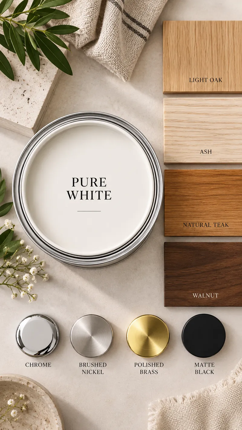
Pure white paint with the woods and metal finishes that suit it: Light oak, Ash, Natural teak, Walnut; Chrome, Brushed nickel, Polished brass, Matte black

The white that makes everything else look deliberate.

A clean, neutral white — no visible yellow, and none of the blue chill of a tube-light white. It gives you the cleanest backdrop there is — art, wood grain and metal all read sharper against it, which is why galleries use it.

It is at its best in a room with good daylight. In a dim, north-facing room it can drift towards grey, and in a home with a lot of dust and small hands it shows every mark — so use a washable finish and get the putty work right first.

Woods

  • Light oak
  • Ash
  • Natural teak
  • Walnut

Metal finishes

  • Chrome
  • Brushed nickel
  • Polished brass
  • Matte black
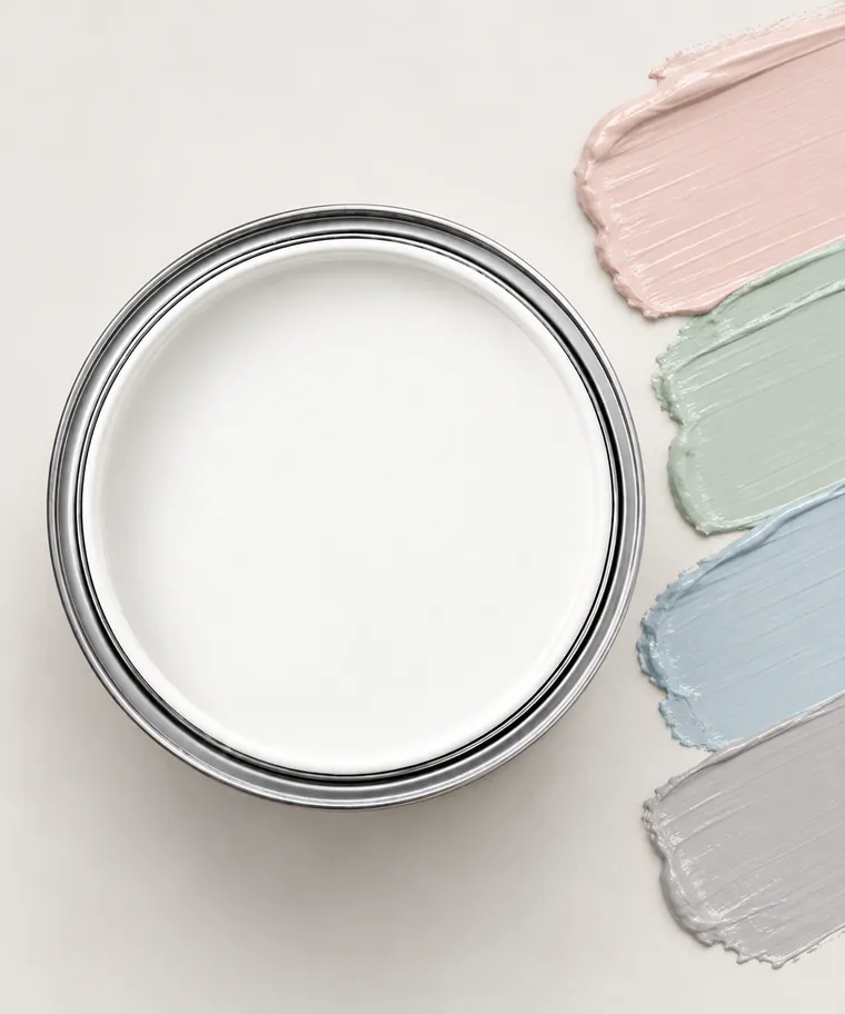
Pure white paint tin with accent colour swatches: Blush, Sage, Powder blue, Dove grey

Accent colours

  • Blush
  • Sage
  • Powder blue
  • Dove grey

Pastels stay clean against a true white instead of looking dusty. Keep them soft and let the white do the work.
Ask for it by name

Tap a name to copy it. The arrow opens the shade on the brand’s own site.

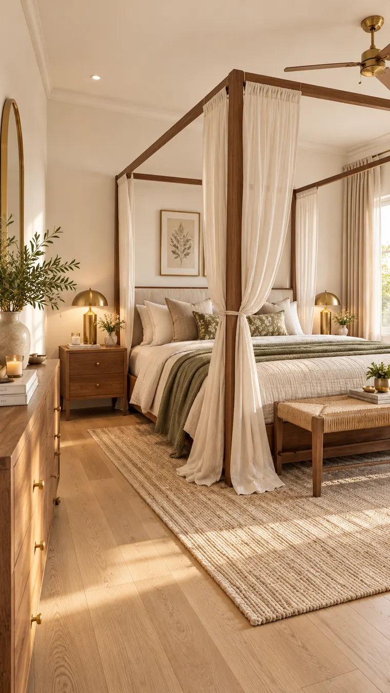
Bedroom with white walls, a walnut four-poster bed, light oak floor, brass lamps and sage bedding
In a bedroom: pure white walls with walnut, light oak and brass.

One pairing to try

Pure white with blush pink

Oak, antique brass and a blush wall or headboard panel — pure white keeps the pink fresh rather than sugary.
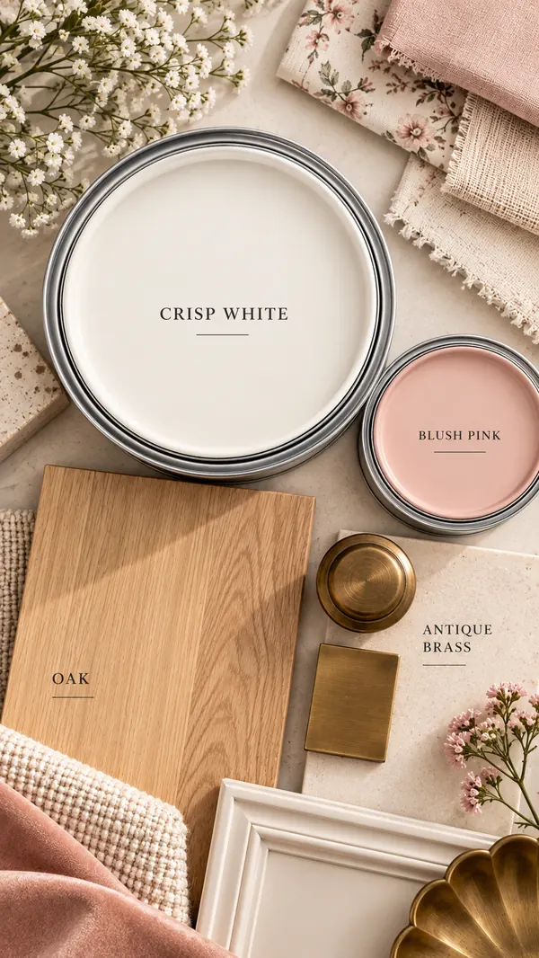
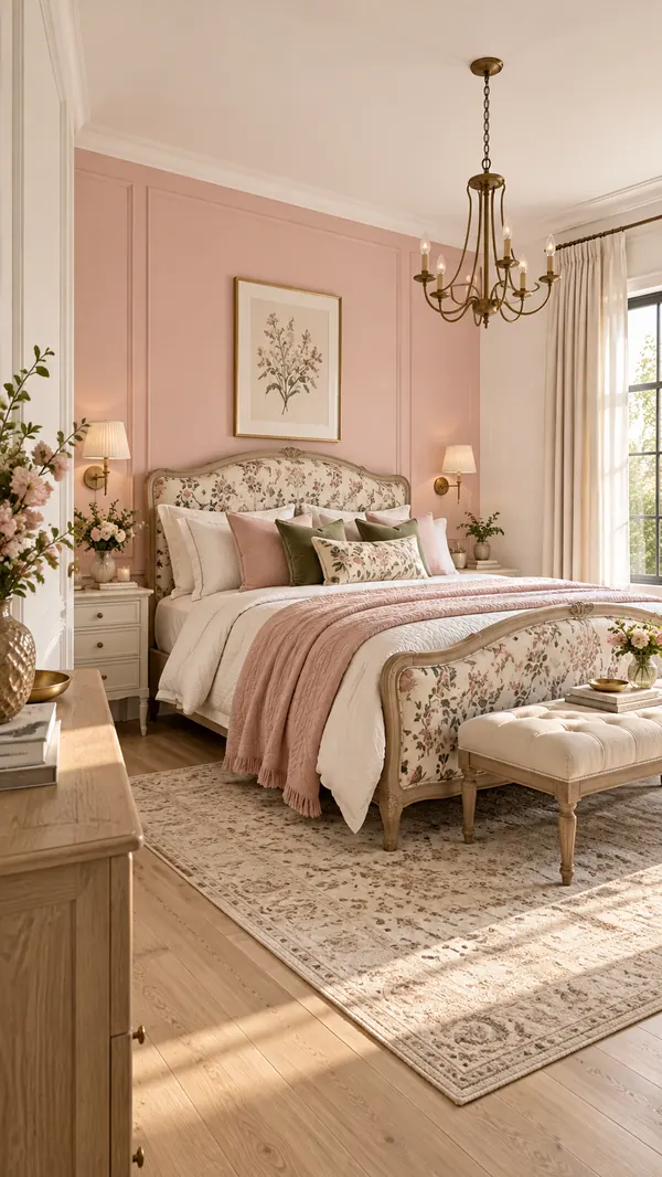
Pure white and blush pink paint with oak and antique brass
Bedroom with a blush pink panelled wall, white trim, floral upholstered bed and brass chandelier

No. 02

Soft white

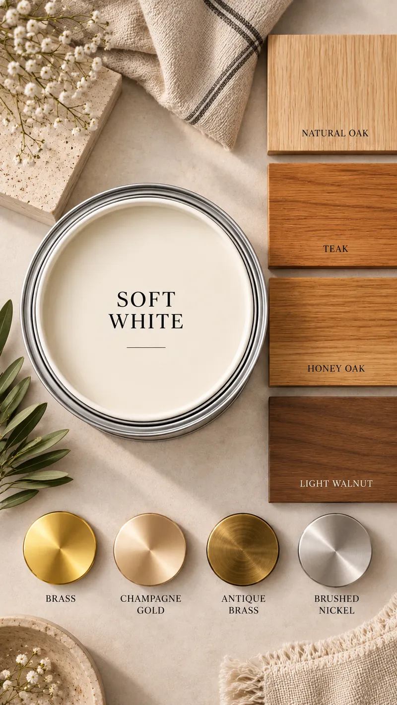
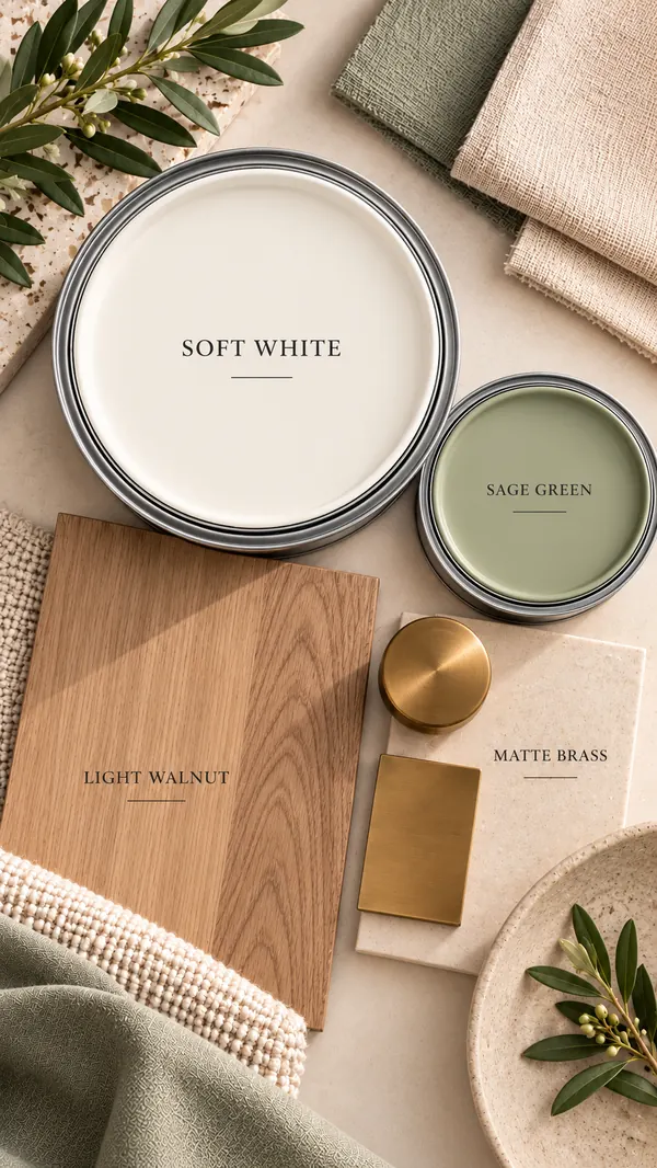
Soft white paint with the woods and metal finishes that suit it: Natural oak, Teak, Honey oak, Light walnut; Brass, Champagne gold, Antique brass, Brushed nickel

White, without the glare.

A white with a drop of cream in it. It is the safest choice if you want one colour across the whole house, because it never looks stark and never looks dirty.

It earns its place in the evening. Under the warm lights most Indian homes switch on after seven, a pure white can turn flat and slightly grey; a soft white just looks warmer. It also flatters teak and honey oak instead of fighting them.

Woods

  • Natural oak
  • Teak
  • Honey oak
  • Light walnut

Metal finishes

  • Brass
  • Champagne gold
  • Antique brass
  • Brushed nickel
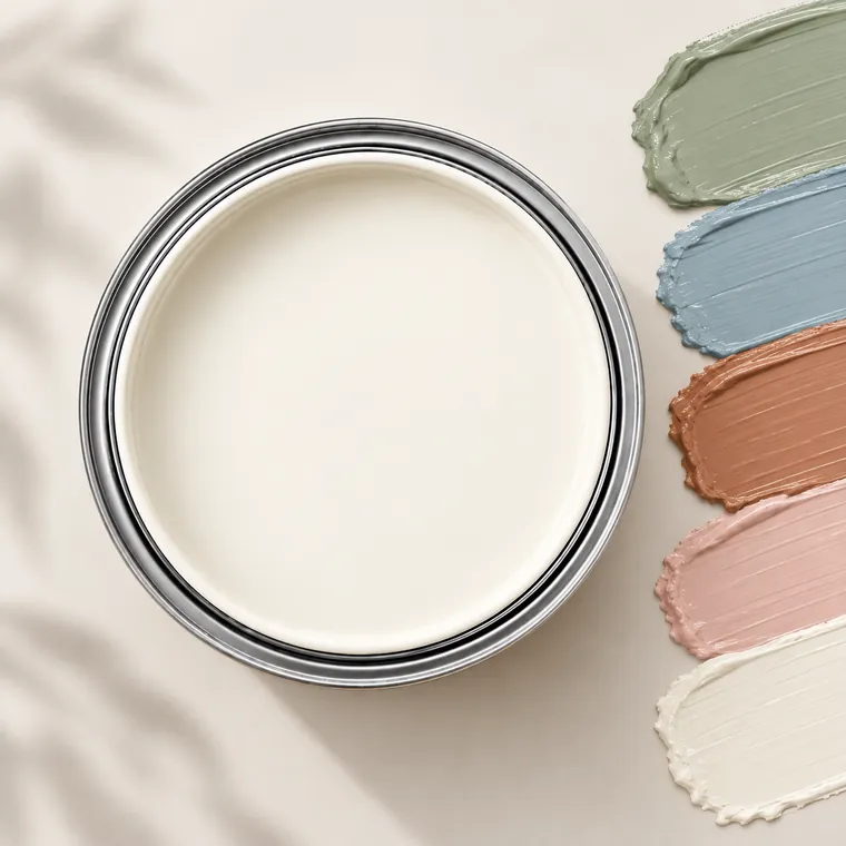
Soft white paint tin with accent colour swatches: Sage, Dusty blue, Terracotta, Blush, Ivory

Accent colours

  • Sage
  • Dusty blue
  • Terracotta
  • Blush
  • Ivory

Muted, slightly greyed accents — the kind you find in handloom and block print — sit naturally on a soft white.

Ask for it by name

Tap a name to copy it. The arrow opens the shade on the brand’s own site.

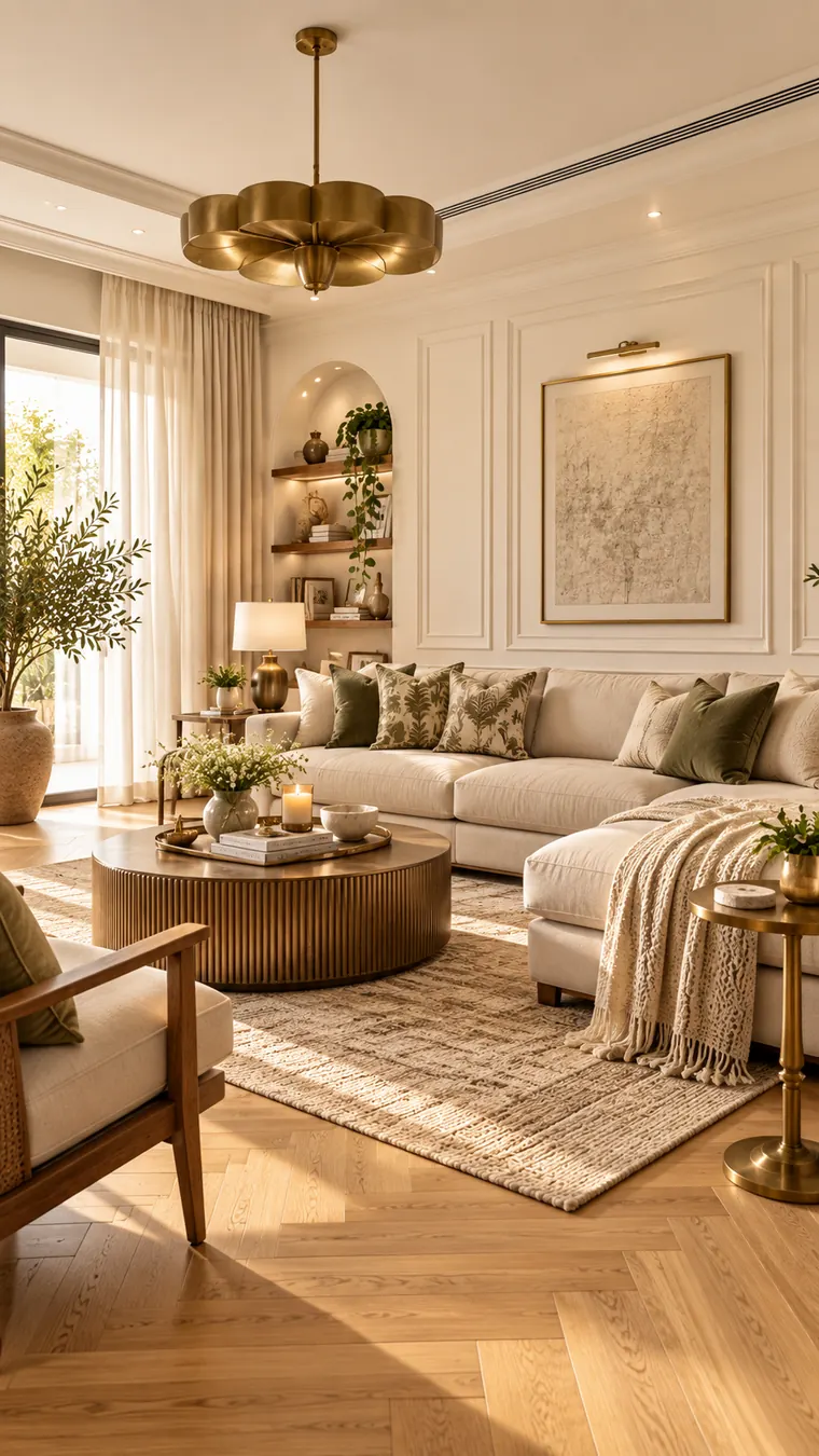
Living room with soft white panelled walls, a cream sectional, light oak herringbone floor, brass pendant and sage cushions
In a living room: soft white with light oak, brass and sage.

One pairing to try

Soft white with sage green

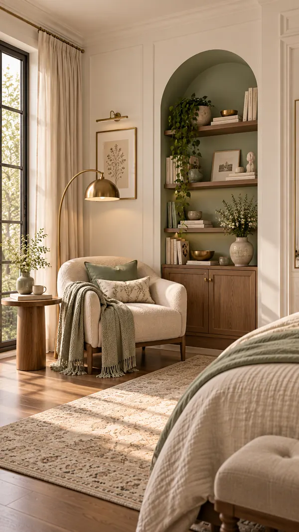
Light walnut and matte brass, with sage inside a niche or on a single wall so the soft white does most of the work.

Soft white and sage green paint with light walnut and matte brass
Reading corner with soft white panelling and a sage green arched niche with walnut shelves

No. 03

Beige

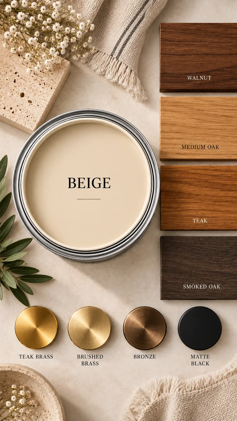
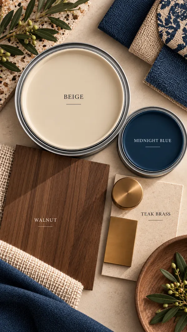
Beige paint with the woods and metal finishes that suit it: Walnut, Medium oak, Teak, Smoked oak; Satin brass, Brushed brass, Bronze, Matte black

The warm one, grown up.

Not the yellow beige of the nineties — a sandy, softer one. Beige is what makes a room feel finished and lived-in rather than new, and it carries mid and dark woods better than any white.

Watch the undertone. In strong west light a beige with too much yellow in it turns custard by four o’clock. If two chips look alike on the card, pick the one that is a shade greyer.

Woods

  • Walnut
  • Medium oak
  • Teak
  • Smoked oak

Metal finishes

  • Satin brass
  • Brushed brass
  • Bronze
  • Matte black
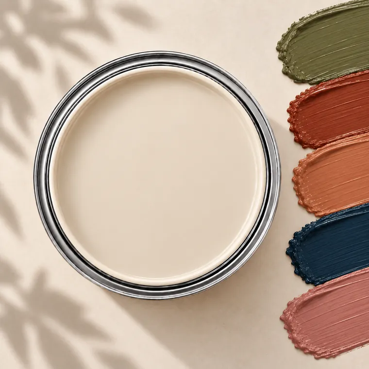
Beige paint tin with accent colour swatches: Olive, Rust, Terracotta, Navy, Dusty rose

Accent colours

  • Olive
  • Rust
  • Terracotta
  • Navy
  • Dusty rose

Earthy accents — olive, rust, terracotta — with one deep navy to stop the room going sleepy.

Ask for it by name

Tap a name to copy it. The arrow opens the shade on the brand’s own site.

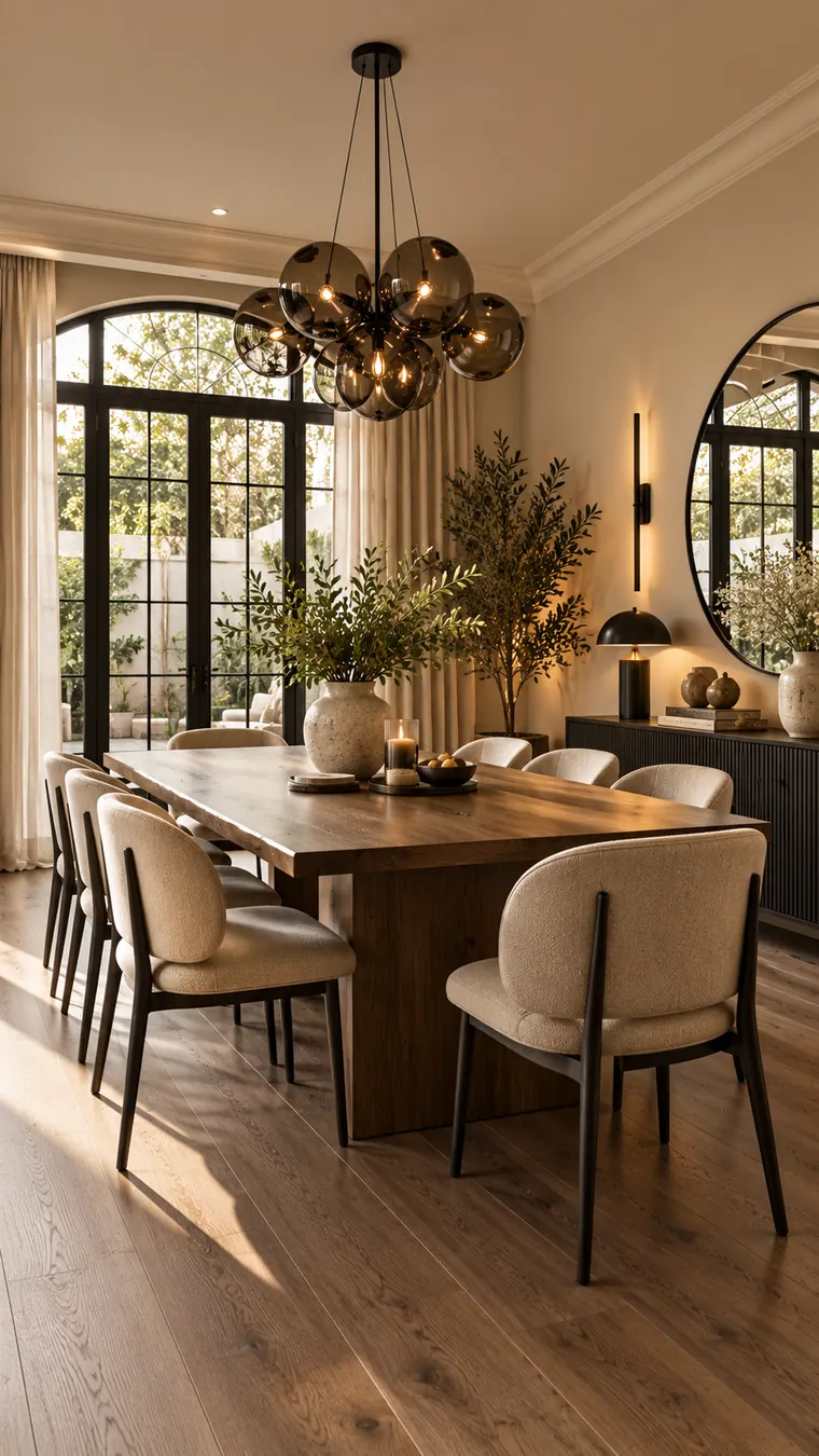
Dining room with warm beige walls, a solid walnut table, cream chairs on black legs and a smoked-glass chandelier
In a dining room: beige with walnut and matte black.

One pairing to try

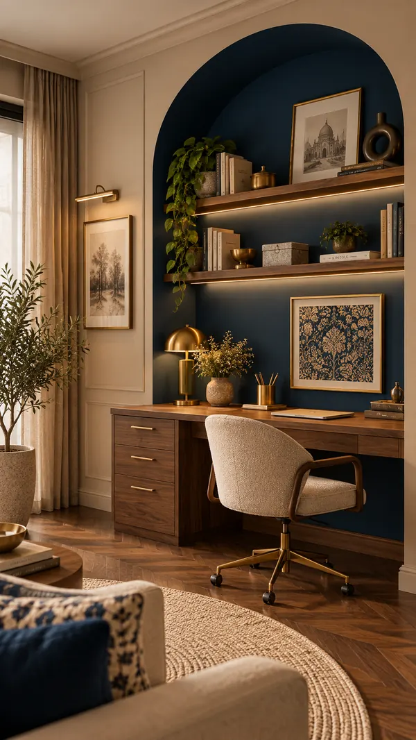
Beige with midnight blue

Walnut and warm brass against one deep navy wall or alcove — beige softens the blue so it reads rich, not cold.

Beige and midnight blue paint with walnut and brass
Study with beige walls and a midnight blue arched alcove holding a walnut desk and brass lamp

No. 04

Light grey

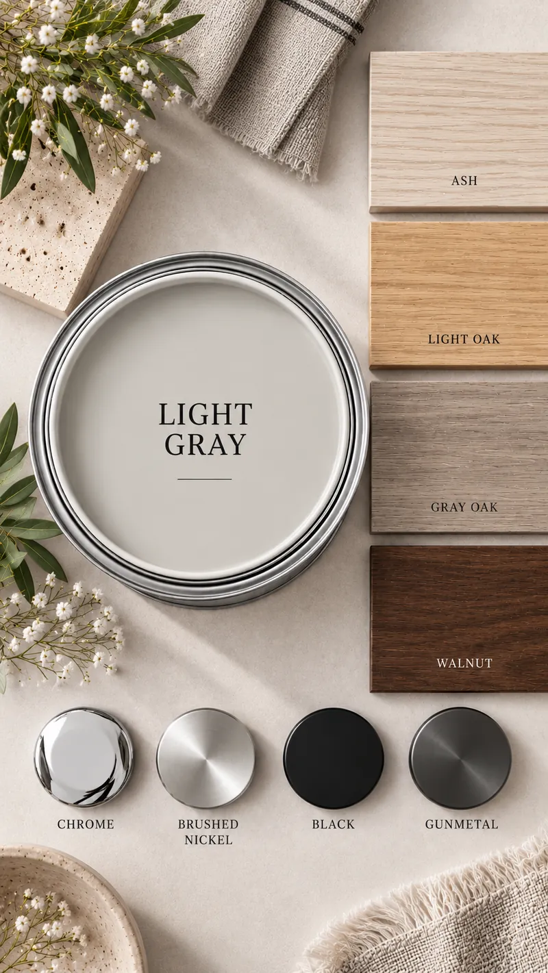
Light grey paint with the woods and metal finishes that suit it: Ash, Light oak, Grey oak, Walnut; Chrome, Brushed nickel, Black, Gunmetal

Calm, cool, and particular about light.

A pale grey gives a room a quiet, tailored look and makes deep colours around it look richer. It is the natural partner for cool metals and grey-washed or pale woods.

It needs light to behave. In a bright room or under the hard afternoon sun it reads crisp and airy; in a dim north-facing room it can turn gloomy. Pair it with neutral-white bulbs around 3000–4000K — very warm LEDs push it towards a muddy beige.

Woods

  • Ash
  • Light oak
  • Grey oak
  • Walnut

Metal finishes

  • Chrome
  • Brushed nickel
  • Black
  • Gunmetal
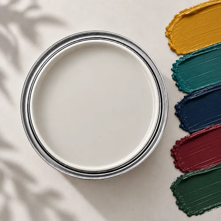
Light grey paint tin with accent colour swatches: Mustard, Teal, Navy, Burgundy, Forest green

Accent colours

  • Mustard
  • Teal
  • Navy
  • Burgundy
  • Forest green

Grey is the one neutral that wants jewel tones. Mustard, teal and burgundy look expensive against it.

Ask for it by name

Tap a name to copy it. The arrow opens the shade on the brand’s own site.

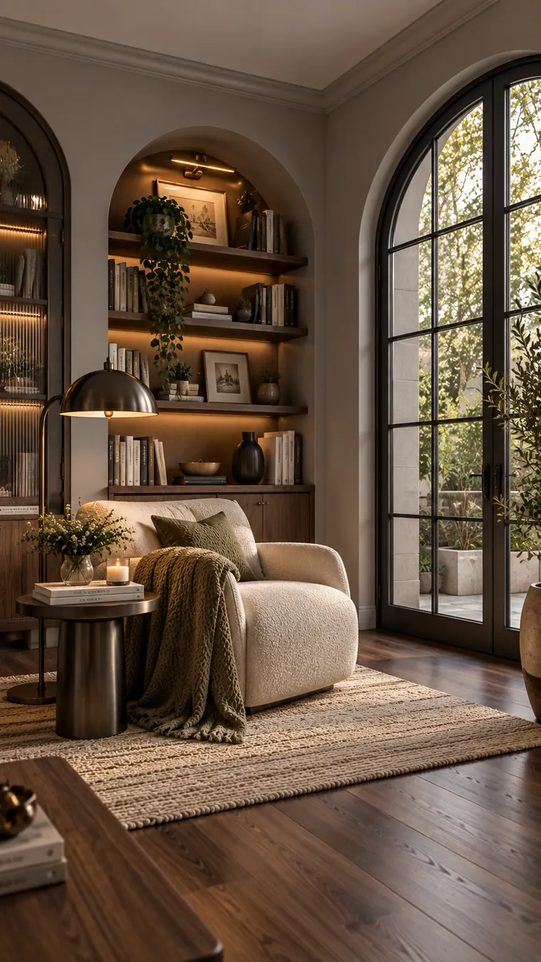
Reading corner with pale grey walls, a lit walnut niche, cream armchair, bronze floor lamp and black steel windows
In a reading corner: light grey with walnut, bronze and black.

One pairing to try

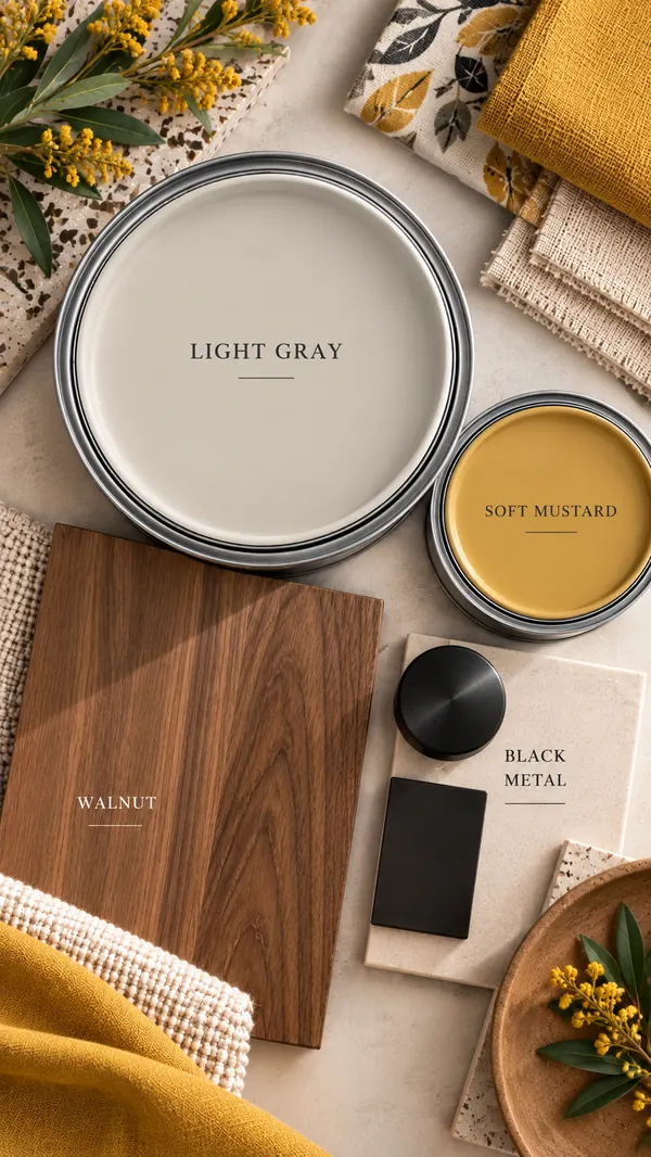
Light grey with soft mustard

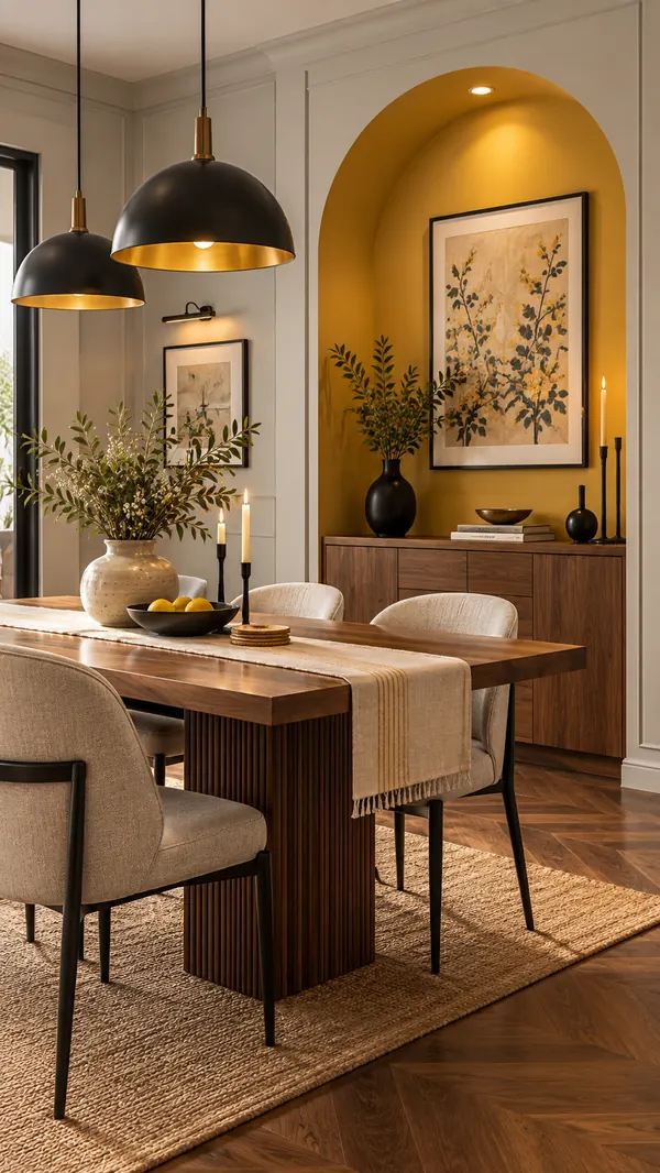
Walnut and black metal, with mustard on one feature niche — grey keeps the yellow grown-up.

Light grey and soft mustard paint with walnut and black metal
Dining room with light grey panelled walls, a mustard arched niche, walnut table and black pendant lights

No. 05

Light taupe

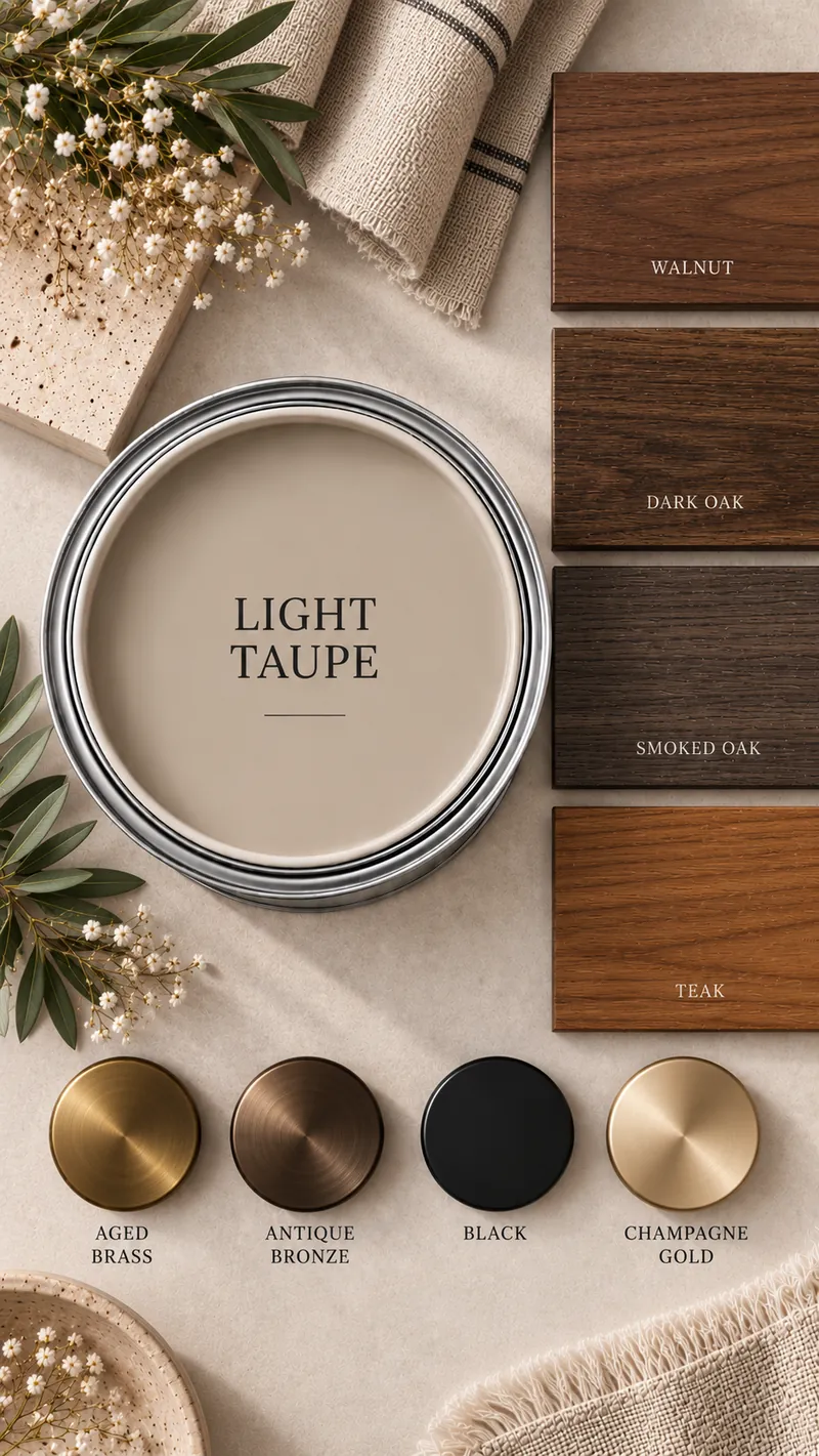
Light taupe paint with the woods and metal finishes that suit it: Walnut, Dark oak, Smoked oak, Teak; Aged brass, Antique bronze, Black, Champagne gold

Warm and moody at the same time.

Taupe sits between grey and brown, so it gives you the depth of a grey with the warmth of a beige. It is the most forgiving of the five with marks and fingerprints, which makes it a good choice for a busy family room or a passage.

It is also the deepest of the five. In a small room with one window, use it on a single wall, or go a step lighter on the card — and keep the ceiling in a soft white so the room doesn’t close in.

Woods

  • Walnut
  • Dark oak
  • Smoked oak
  • Teak

Metal finishes

  • Aged brass
  • Antique bronze
  • Black
  • Champagne gold
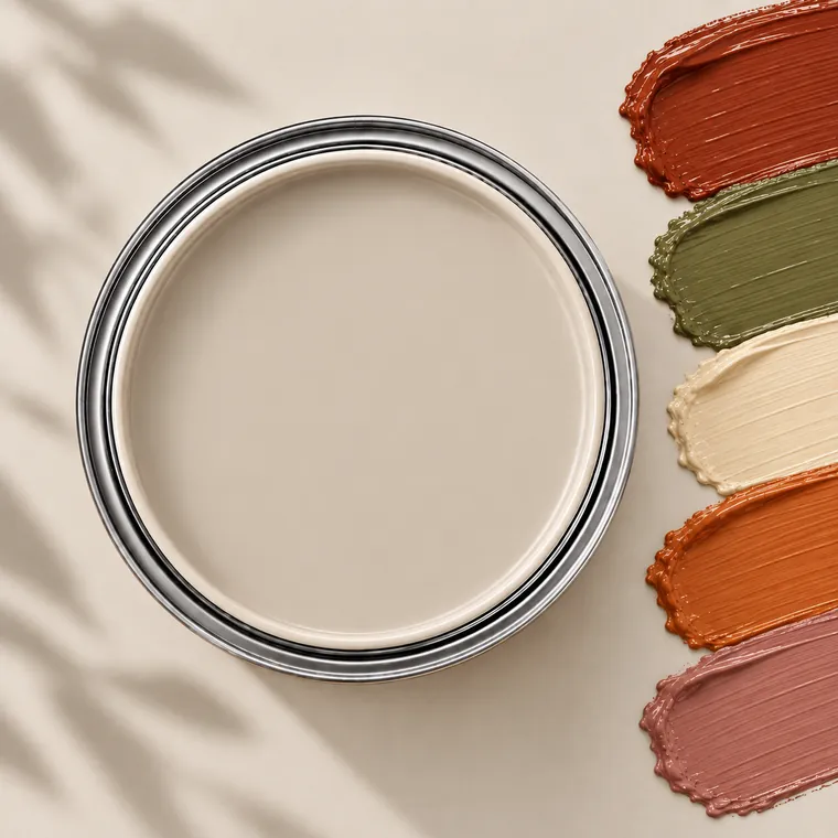
Light taupe paint tin with accent colour swatches: Rust, Olive, Cream, Burnt orange, Dusty rose

Accent colours

  • Rust
  • Olive
  • Cream
  • Burnt orange
  • Dusty rose

Spice-market colours — rust, burnt orange, olive — warm taupe up; a cream accent keeps it from getting heavy.

Ask for it by name

Tap a name to copy it. The arrow opens the shade on the brand’s own site.

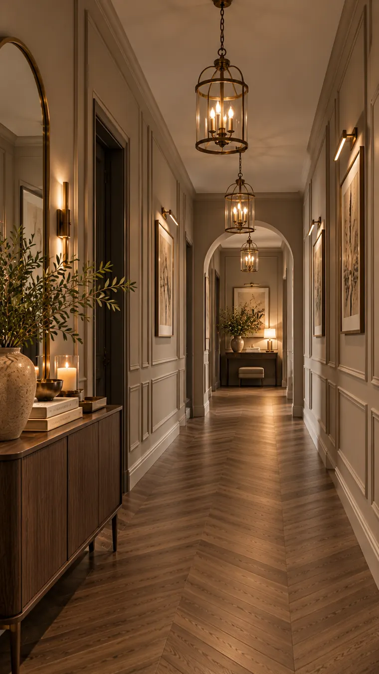
Hallway with taupe panelled walls, walnut herringbone floor, brass lanterns and sconces
In a hallway: light taupe with walnut and aged brass.

One pairing to try

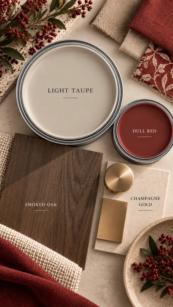
Light taupe with dull red

Smoked oak and champagne gold, with a muted red feature panel — taupe takes the edge off the red.

Light taupe and dull red paint with smoked oak and champagne gold
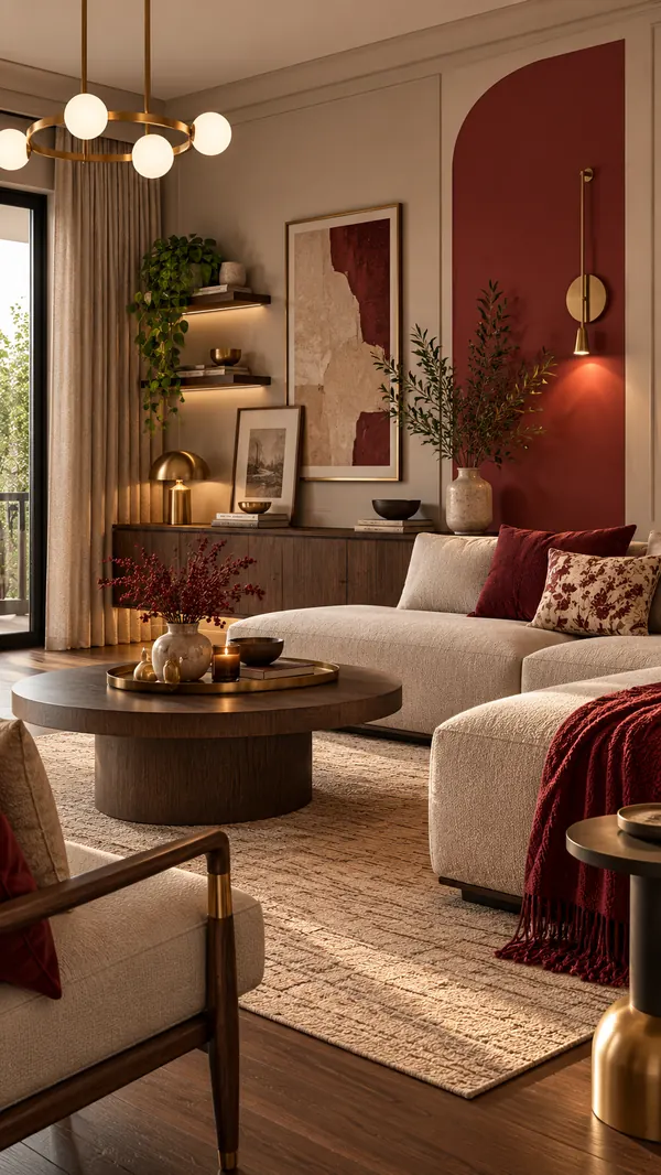
Living room with light taupe walls, a dull red arched feature panel, cream sofa and brass lighting

Before you buy the paint

Four things that decide whether a neutral works.

Find the undertone first

Hold the chip against a sheet of plain printer paper. Whatever it leans towards — yellow, pink, green or grey — is exactly what your wall will show, only louder.

Let the wood decide the warmth

Teak, honey oak and walnut want a warm neutral. Ash, grey oak and pale laminates want a cooler one. When the wood and wall disagree, the room feels off even when every piece is lovely.

Judge it at night

Most Indian living rooms are used after dark. Look at a painted A3 board under your own bulbs before you commit — warm LEDs push beige yellow and turn grey muddy.

Keep one white for every ceiling

Use a single soft white on all ceilings and trims across the house. It ties rooms with different wall colours together and stops a pure-white ceiling making a warm wall look dirty.

Colours on screen are approximate and vary between devices and in different light. Always do a swatch test on your own wall before buying paint. Shades are grouped into five commonly used interior neutrals; brand names listed are close matches, not exact equivalents. Brand names and codes belong to their owners.

Want to learn colour properly?Mastering Color Combinations — the courseThe colour wheel, undertones and how to build a palette that holds up in an Indian home.

Go deeper

Picking a neutral is easy.
Building a room around it is the skill.

Mastering Color Combinations takes you from the colour wheel to a full palette that holds up in an Indian home — undertones, colour psychology, and assignments to try on your own walls.

  • Colour wheel & theory
  • Undertones
  • Colour psychology
  • Palette building
  • Practice assignments