ColorazaLearn · Design · Manifest

Five pastels that hold up
in Indian light.

Sage, powder blue, lilac, blush and butter yellow — where each one actually works, what to put next to it, and the closest match at six different paint brands. Free, no sign-up.

Before you scroll

Shade names travel badly between brands. Ask a painter for ‘sage’ and you will get four different greens depending on which fan deck is in his bag. So each shade below carries four names — one per brand — chosen as the closest match to the same colour, not as four different colours.

Take the name to the dealer and ask for that exact code. Substituting ‘something similar’ is where most pastel schemes go wrong: half a step warmer or greyer is invisible on a card and unmissable across a wall.

No. 01

Sage green

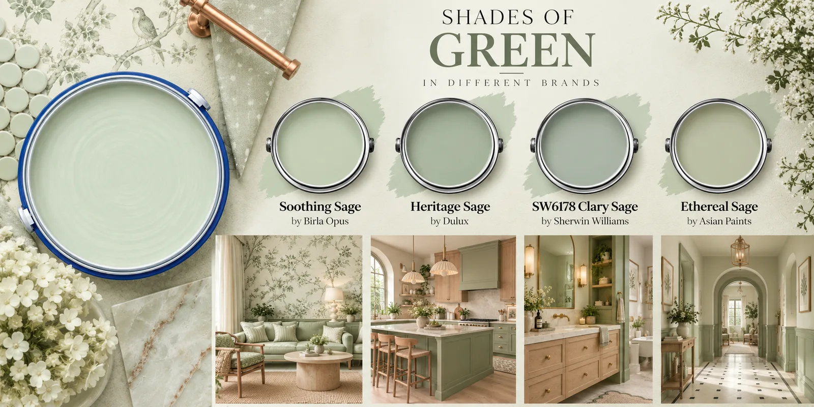
Shades of green in different brands — Soothing Sage by Birla Opus, Heritage Sage by Dulux, Clary Sage SW6178 by Sherwin-Williams and Ethereal Sage by Asian Paints, with sage living room, kitchen, bathroom and hallway interiors

The one that behaves in every room.

Sage sits almost exactly between warm and cool, which is why it survives an Indian afternoon without turning acid the way a brighter green does. Against teak, cane and unbleached cotton it stops reading as a colour at all and starts behaving like a neutral.

It is the safest of the five on a full wall — including the wall behind a television, where a stronger colour competes with the screen every evening.

Pairs withTeak or oak, unlacquered brass, off-white cotton, terracotta, cane.
Ask for it by name

  • Soothing SageBirla Opus
  • Heritage SageDulux
  • Clary Sage SW 6178Sherwin-Williams
  • Ethereal SageAsian Paints

No. 02

Powder blue

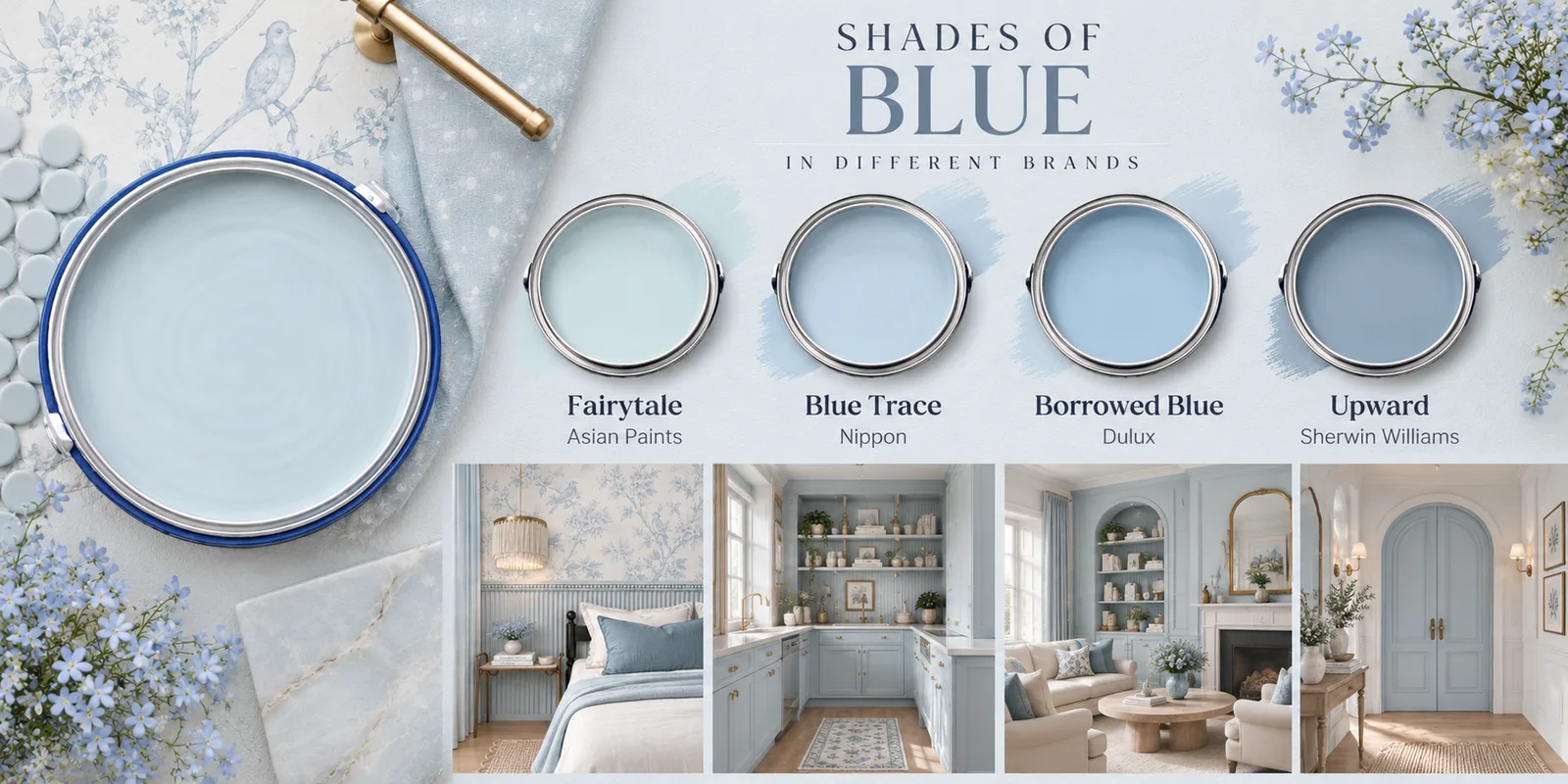
Shades of blue in different brands — Fairytale by Asian Paints, Blue Trace by Nippon, Borrowed Blue by Dulux and Upward by Sherwin-Williams, with powder blue bedroom, kitchen, living room and entrance interiors

Cool light, made deliberate.

Blue is the pastel most sensitive to which way your windows face. In a north-facing room it can drift cold and slightly grey; in the hard west light most Indian flats get after four o’clock it settles into something calm and faintly grand.

Use it where you want the room to feel cooler than it is — bedrooms, bathrooms, a study — and let every bit of warmth come from wood, brass and textiles rather than from the paint.

Pairs withWarm wood, brass, white marble, indigo and ivory textiles.

Ask for it by name

  • FairytaleAsian Paints
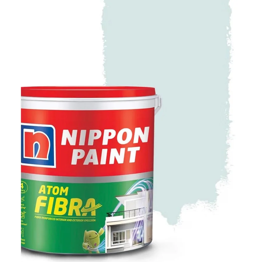
  • Blue TraceNippon Paint
  • Borrowed BlueDulux
  • UpwardSherwin-Williams

No. 03

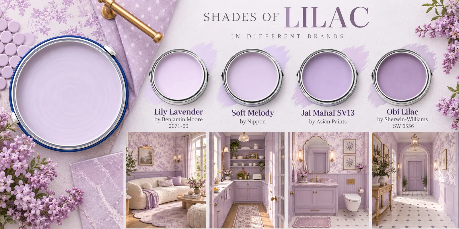
Lilac

Shades of lilac in different brands — Lily Lavender 2071-60 by Benjamin Moore, Soft Melody by Nippon, Jal Mahal SV13 by Asian Paints and Obi Lilac SW 6556 by Sherwin-Williams, with lilac living room, kitchen, bathroom and hallway interiors

The pastel people are most afraid of.

Lilac has a reputation problem: most people remember it as a colour from a child’s bedroom. The four below are far greyer than that memory — closer to a dusty mauve than to violet.

On joinery, in a powder room, or on one wall of a bedroom it reads as considered rather than sweet. It is also the only pastel here that sits happily against both cool grey stone and warm wood, which makes it unusually easy to build a room around.

Pairs withPale grey stone, brushed nickel or brass, cream, a deep aubergine accent.

Ask for it by name

  • Lily Lavender 2071-60Benjamin Moore
  • Soft MelodyNippon Paint
  • Jal Mahal SV13Asian Paints
  • Obi Lilac SW 6556Sherwin-Williams

No. 04

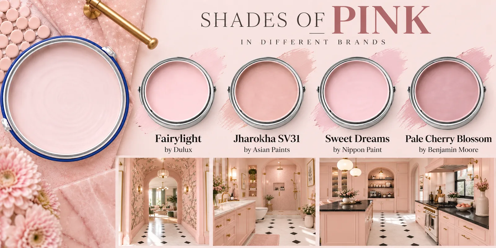
Blush pink

Shades of pink in different brands — Fairylight by Dulux, Jharokha SV31 by Asian Paints, Sweet Dreams by Nippon Paint and Pale Cherry Blossom by Benjamin Moore, with blush pink hallway, bathroom and kitchen interiors

Warmer than white, quieter than terracotta.

A blush wall does the job of an off-white without the flatness. It keeps a little colour after dark, when the ceiling lights come on — which is when most Indian living rooms are actually used, and when a cool white goes lifeless.

One warning worth taking seriously: blush pales out dramatically once it covers a whole wall. Whatever you choose off the fan deck, go one step deeper.

Pairs withBlack or deep green joinery, brass, cane, a warm white ceiling.

Ask for it by name

  • FairylightDulux
  • Jharokha SV31Asian Paints
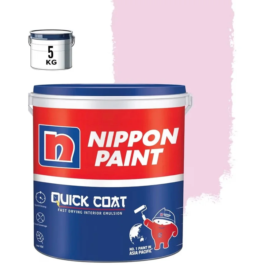
  • Sweet DreamsNippon Paint
  • Pale Cherry BlossomBenjamin Moore

No. 05

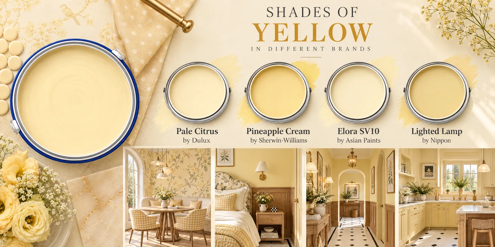
Butter yellow

Shades of yellow in different brands — Pale Citrus by Dulux, Pineapple Cream by Sherwin-Williams, Elora SV10 by Asian Paints and Lighted Lamp by Nippon, with butter yellow dining room, bedroom, hallway and kitchen interiors

Borrowed daylight for a dark room.

The most genuinely useful of the five if you have one small window, or a room that opens onto a shaft. Butter yellow bounces the little light there is instead of swallowing it, and unlike a white it refuses to go grey in shade.

It is also the strongest of the five. Keep it to the smaller rooms — a kitchen, a passage, a stairwell, a study — rather than spreading it across an open living and dining area.

Pairs withWhite trim, warm wood, a checkerboard floor, sage green as a companion.

Ask for it by name

  • Pale CitrusDulux
  • Pineapple CreamSherwin-Williams
  • Elora SV10Asian Paints
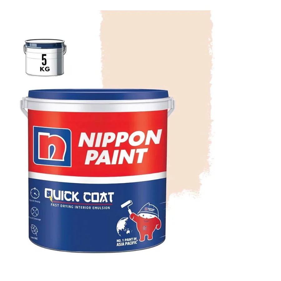
  • Lighted LampNippon Paint

Four things that decide whether it works

A pastel is only as good as the wall it lands on.

Test on a board, not on the wall

Buy the smallest tin, paint two coats on an A3 sheet of primed board, and move it around the room for two days. A patch painted straight onto an old wall borrows the colour underneath it.

Judge it at night as well as noon

Most Indian living rooms are used after seven. Warm LEDs push blush and butter yellow further warm and can grey a powder blue completely — look at the board under your own lights before you commit.

Take the ceiling one step lighter

The same shade top and bottom makes a room feel shorter. Ask for the ceiling in a lighter tint of the wall colour, or a warm white — not a cool builder white, which will make the pastel look dirty.

Match the finish to the room

Matte forgives an uneven wall and suits bedrooms and living rooms. Passages, kitchens and children’s rooms need a washable satin, which shows every patch — so the putty work has to be right first.

Go deeper

One pastel is easy.
Five that agree is a skill.

Every shade on this page is a starting point, not a scheme. Mastering Color Combinations in Interior Design is the course that takes it the rest of the way — the wheel and the theory behind it, what colour does to a room psychologically, how to build a palette that survives an Indian home, and assignments to test it on your own walls.

  • Colour wheel & theory
  • Colour psychology
  • Palette building
  • Indian interior context
  • Practice assignments